Case Study - MarketMate
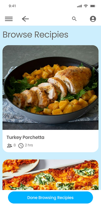


The product
Design an intuitive in-store navigation experience that reduces time spent searching and helps users stay on budget.
Project duration
Problem
In-store grocery shopping is inefficient. Users struggle to find items, manage shared shopping needs, and shop within time and budget constraints.
Goal
Design an app and a responsive website for a local grocery store that helps shoppers locate products as they shop in person.
Role
Lead UX designer
Responsibilities
User Research, Personas, Problem statements, Empathy Maps, User Journey Maps, Insight Extraction, Paper Wireframes, Digital wireframes, Low-fidelity prototype, Usability studies, Mockups, High-fidelity prototype, Accessibility

Understanding the user
User research
14 users
Tasks
-
Create a group and add group members
-
Asked about new iconography for read aloud text
-
Asked to find and add recipes
-
Asked about how and where users shop for groceries
-
asked about how useful the app would be in a grocery store
User research: summary
-
Difficulty finding items
-
Store layout confusion
-
Specialty & niche items hard to locate
-
Unfamiliar product categories
-
-
Time
-
Time pressure driving shortcuts
-
-
Attention
-
Distraction & lost place
-
-
Budget
-
Budget as a primary constraint
-
-
Planning
-
Low or no planning
-
User research: pain points
1. Difficulty finding items
2. Budget constraints
3. Lack of Time
4. Lack of planning
Personas
Name: Nadia Miller

"I've been coming here for years and I still can't find things when they move everything around."
Goals
-
Get in and out without backtracking
-
Stick to her routine without surprises
-
Find staples in the same place every visit
Frustrations
-
Seasonal resets move her usual items
-
No signage explains what moved where
-
Reluctant to ask staff; feels embarrassed
Age:
Education:
Hometown:
Family:
Occupation:
28
University graduate
Denver Colorado
Wife
Office manager
User journey map


Starting the design
Paper
Wire-frames

Digital Wireframes


Low-fidelity prototype

Usability study: findings
Some features did not work as initially expected by some users. In particular some users expected to be able to add multiple recipes at a time.
1. Adding recipes needs to be more clear (P1)
2. Update text to speech icon (P2)
3. demonstrate how multiple groups would work (P2)


Refining the design
Mockups
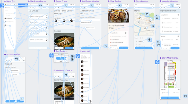
Full set of designs


Accessibility considerations
1. Read aloud is provided for people with low vision or people who have trouble reading
2. All colors are compliant with AA WCAG 2.1 guidelines in order to help users with color blindness or users who require high contrast.
3. The list generation process has been broken up into small digestible pieces to help users maintain focus and reduce the cognitive load.
Impact
-
Users valued the in-store map and aisle-based ingredient sorting
-
Improved clarity around multi-recipe and group shopping flows
-
Reduced cognitive load through progressive disclosure and clear hierarchy
-
Most users said they would appreciate the store map and thought the application would help them not miss ingredients in the aisle.
-
Users found value in the ability to sort all the ingredients for recipes into the aisle the ingredients could be found in.

Going forward
Lessons Learned
Making changes in Figma to designs is very costly. It made me appreciate the wisdom of settling on designs early and making designs into components so that changes can be propagated through the project
Next Steps
Find grocery stores to pair with for mapping the store and beta testing.
-
Work with product managers and developers to have the application developed
- Work with the marketing team to create marketing campaign