SOAR UX Audit

Sierra Overlook Animal Rescue (SOAR) is dedicated to rescuing and rehabilitating at-risk animals, providing lifelong sanctuary to those in need, and protecting local ecosystems through conservation efforts.
Client Goals
Increase funds raised
Allow users to learn about the cause
Evaluation Framework
Nielsen's 10 Heuristics
WCAG
Heuristic Evaluation
-
-
fail - no loading indicator
-
-
Match Between the System and the Real World
-
pass
-
-
-
pass
-
-
-
fail - icons different sizes
-
-
-
pass
-
-
Recognition Rather than Recall
-
pass
-
-
Flexibility and Efficiency of Use
-
pass
-
-
Aesthetic and Minimalist Design
-
pass
-
-
Help Users Recognize, Diagnose, and Recover from Errors
-
pass
-
-
-
fail, none provided
-
Evaluate Key User Flows
-
Raise funds
-
donations
-
store
-
-
Learn about the cause
-
-
initiatives
-
foster
-
sign up for services
-
sign up for events
-
volunteer
Check Performance and Mobile
Performance should be improved to 400ms where possible. When not possible a loading indicator should be shown.
Accessibility
-
Text in footer is unreadable
-
Some images require alt text
Results
Before

After

Recommendations
-
Make the interface simpler by removing a drop down menu into text headers (Occam's Razor)
-
Make icons the same height as menu button (Consistency and Standards)
Before

After

Recommendations
-
Make the "Learn More" button more attention grabbing (Fitts' Law/Color contrast)
Before

After

Recommendations
-
Make the table in "Services" narrower so the user doesn't need to "draw" lines between the values. (reducing cognitive load)
Before

After

Recommendations
-
Move contact information into footer. (consistency / Occam's Razor)
Before

After
Recommendations
-
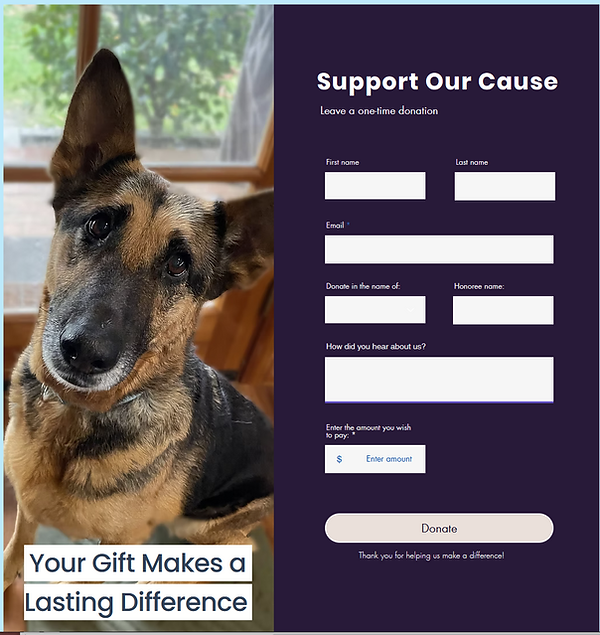
Balance the design
-
Make the donate button a different color so it's easier to see (color contrast / emphasizing goals)
Before

After
_PNG.png)
Recommendations
-
Show all the text in the All Products section (Occam's Razor)
Future Steps
Continue working with client on improvements